Final Fossils: Field
Posted: May 5, 2014 Filed under: Field, Personal Leave a commentAfter firing, my sky blue and lichen yellow tiles weren’t those colours at all, they were a weird collection of metallic shades and greys and blacks, they looked lifeless and ugly. They looked like fossils, like this:

Fossilised wood
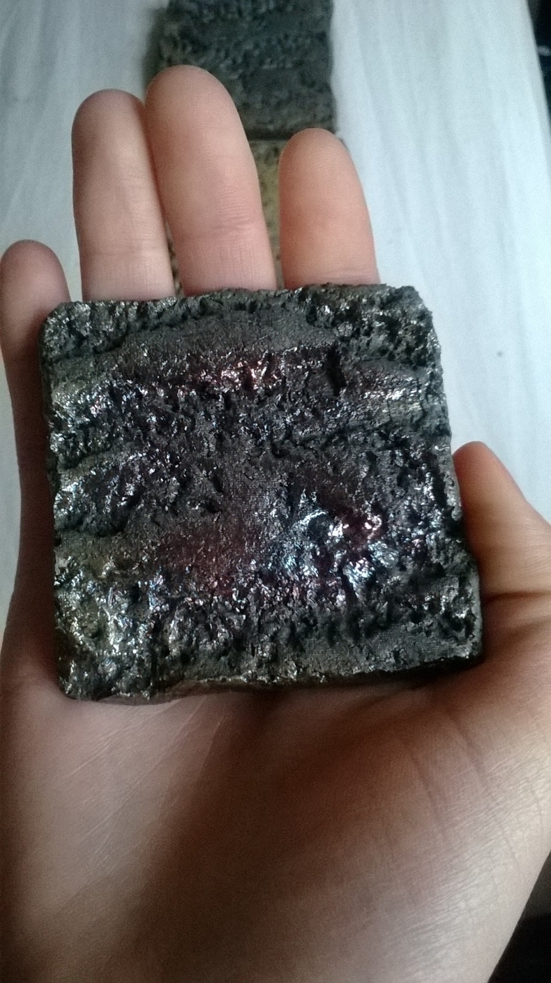
These ugly things sat on my desk, I was disappointed and frustrated by how grim they were, uncomfortable to hold in the hand, and not at all easy on the eyes. What to do with them??

“Fossil” in the hand, an ugly little thing.
What if they were fossils? Where were they from, what was their story? I looked back over my initial interests within the brief, my fascination with the future and what might become of our cities. Perhaps these ugly things could be the result of a return trip to Earth after a long time away, colonising other planets, other solar systems. What were these ancient structures, these familiar trees now completely forgotten by human kind? Ugly samples, collected by excited scientists, categorised and labelled, then displayed in a museum in a faraway galaxy….
Another “fossil”, metallic glaze.

The yellow has come out in this one, and the circle of yellow glaze looks a little like lichen itself

Three tiles next to each other, hints of the colours and metallic sheens, textural but ugly.

A group of the finished tiles, resting on a cork board
Lichen Textures in Felt
Posted: May 5, 2014 Filed under: Field, Personal Leave a commentUsing hand dyed wool, silk fibres and silk dupion, I have been making textured felt to emulate the surfaces of the tree trunks I have been looking at in my project. If I had more time, I’d be interested in making a clay structure to sit inside the felted “tube”, that would hold it rigid and could be free-standing. I think a clay rod that had a cup form at either end (the interior of the cups could be glazed in lichen colours) would work. A group of them, stood in rows, like the rows of city trees, could be very effective.

Felted Bark Texture

Felted Bark Texture
Field: Texture
Posted: April 7, 2014 Filed under: Field, Personal Leave a commentThree artists whose use of texture I find exciting!

Textural tile looking at Lichen, in white porcelain, by Heather Knight
Heather works almost exclusively in white porcelain, using hand building processes to create textural wall tiles inspired by natural forms. I would be interested in exploring porcelain in the future, although not for this project (due in part to time constraints, but also my preference for the raku firing process), but the use of texture and direct observation and replication of textural patterns observed in nature are directly relevant to my project. In my own project, I will look at using white glaze to allow the textures to take the fore in my pieces, and compare them to coloured pieces.

Textural fragments, based on found pieces of bone, in porcelain, by Jenny Pope

Wearable texture, porcelain form by Jenny Pope
Jenny Pope’s work is heavily inspired by items she finds whilst beach combing, traversing familiar routes and finding unfamiliar objects along them. Like Heather Knight, she also works in white porcelain, and creates incredibly detailed textural pieces. I like the way her pieces are created to sit in groups, as collections of observational pieces, collections of fragmentary responses to fragmentary objects. Her direct response to found textures and grouping of themed pieces is interesting to me, and relevant to what I am working on.

Bark Cloth, Angelina and bronze mesh sample by Alysn Midgelow Marsden
Alysn Midgelow Marsden uses varied media and stitch embellishment techniques to make textural wall hangings and art sculpture, as well as leading technique based workshops, teaching her techniques to others. I first came across her work in 2008, and fell in love with the rich colours and stitched textures in her work. I’d like to utilise stitch and embellishment, as well as multi-media layering in my own pieces for this project.
To move forward, I’d like to explore contrasting media, such as ceramics with softer materials like felt, and explore creating texture in hard/soft materials, and combining them to create juxtaposed pieces that have conflicting properties.
The Reduction Technique in Raku
Posted: April 7, 2014 Filed under: Field, Personal Leave a comment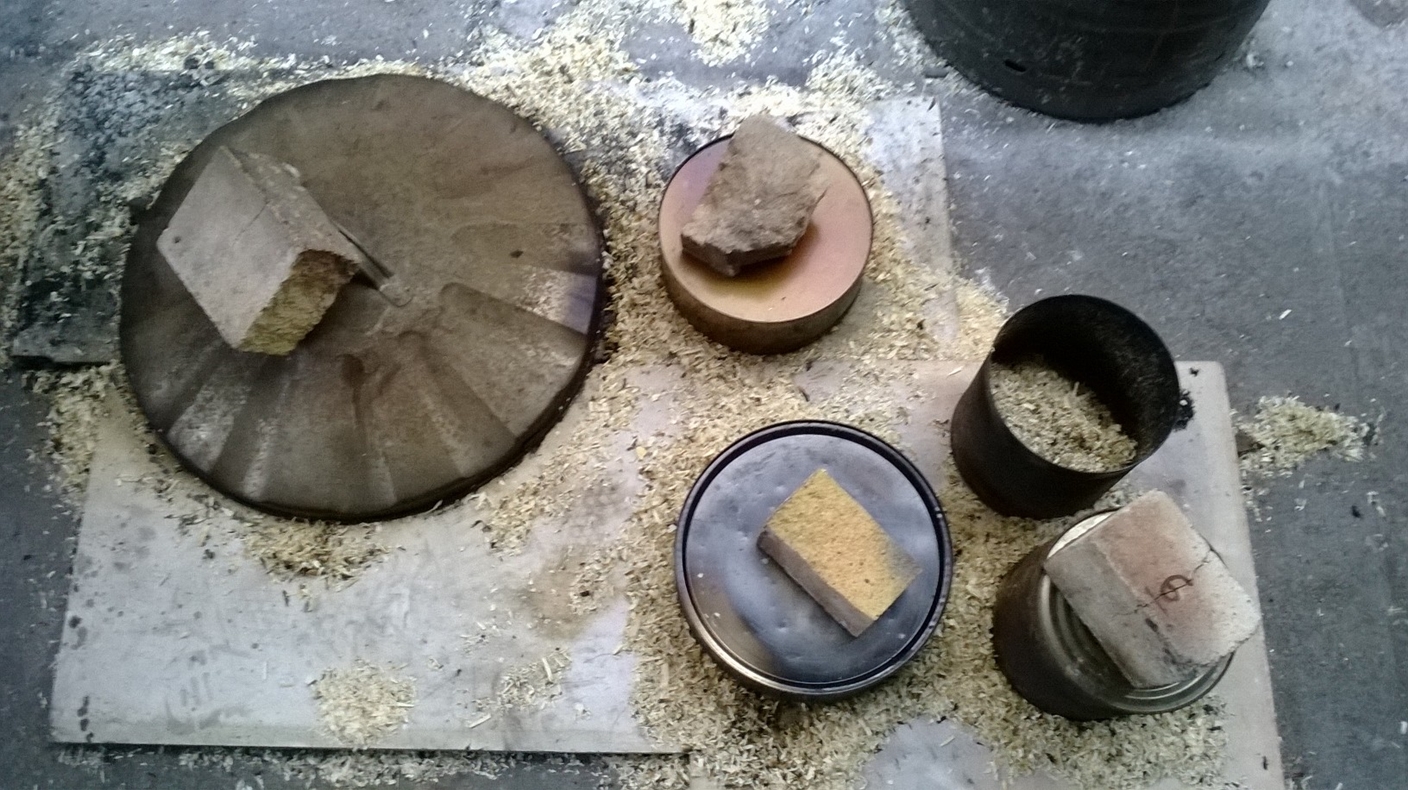
Using sawdust and tins to create a reduction atmosphere to mature the glazed pieces
The glowing pieces are lifted from the kiln, and placed on a bed of sawdust and newspaper. More newspaper and sawdust is thrown over them, and then as the material catches and flares up, the tins are slammed down over them, and held with kiln bricks. The smoke is thick and acrid, and gets up the nose, in the eyes, and lingers in the clothes.
Field: Final Presentation
Posted: April 7, 2014 Filed under: Field, Group Leave a commentOur final presentation for the group project went well, we had really positive feedback. I really enjoyed the unit, and it has been great to work with such a diverse and enthusiastic group of creative people.

Slide 1, our new concept name

We named our concept to reflect the sometimes opposite forces of art and science, coming together to create the happy homes of the future
We began looking at what the future of cities meant for each of us, discussing future habitats and distant dreams of imagined dystopian urban futurescapes, within the umbrella of power and technology. We pondered an ideal way forward, united in a quest for sustainable living, we talked of low impact building, with an emphasis on light and structure, we talked about happiness and wellbeing within the super-built environment. How to not feel anonymous and alone in the hive of the city centre. We wanted to provide a sustainable, eco-conscious, eco-friendly solution to the misery of the concrete jungle, to provide sustainable happiness, fulfillment and contentment for the inhabitants of our great urban sprawls. We began looking into “passive houses” made of environmentally friendly materials with vegetation growing over to act as insulation, taking inspiration from the earth sheltered building techniques employed in the creation of the Camarthen Botanical Gardens. Our first concept we named GlaD, our truncated icosohedric pod structure, that could stack up, or be single storey, and would have a central communal kitchen and living area,
with sleeping areas surrounding it. It would feature solar panels, water capture systems and a steel and glass construction, made from reproducible standard units, making them affordable and easy to construct. Following productive feedback on our first presentation, we took a leap into the realm of sci-fi and “Design Fiction”, and taking inspiration from revolutionary architects such as Joaquim Mitchell, we came up with our current concept. GlaD has evolved, to become a habitable bio-structure, a grown home habitat incorporating solar leaf power sources, interconnected root systems for mass communication within the city, and bio-spliced lighting and food sources. The flora we initially designed to be apart of the building has grown to be the building itself, creating a symbiotic relationship between home and homeowner. Our new concept has been put together as not only a proposal for the building of future urban spaces, but also as a way of cultivating happiness within the cities of the future. The Office for National Statistics suggests that the factors most associated with personal well being are health, employment and relationship status, and cite access to green spaces and a sense of community as integral to happiness. We believe cities contribute negatively to these factors by having high levels of pollution, low levels of satisfying or fulfilling work available, and despite high population densities, people consistently report feeling lonely and isolated within them. Our building concept addresses these factors by being eco-friendly and non-polluting, providing communal living on a massive scale, the entire city interlinked and communicating, and by providing fulfilling work to maintain and care for the bio-structures and more vulnerable members of the community. We’ve discussed fire prevention systems, such as the solar panel leaves having fireproof surfaces that curl down and envelop the living pods when a distress signal is received from another pod structure in the city. The pods could communicate to inform other inhabitants of sickness, or sadness, or to transfer energy from passive pods to ones needing more power at that time. We thought about implementing pitcher plant DNA to create a waste recycling system, Onion DNA to create translucent areas for windows, Aloe Vera DNA to harvest rain water and Sun Flower DNA to track the sun’s movements to maximise power production. A super-hybrid bio-home that can be eaten for sustenance, and sustained by the waste products of the inhabitants, a perfect relationship. We’ve also talked about how parents could take cuttings from their home to give to their children to grow on, to give them a helping hand onto the property trellis! The living city, grow your own home!

A felted piece I made to demonstrate the interior walls of the bio-pods

A felted pod I made to articulate the interior sleeping pods, with bio-luminescent bacteria (beading) and root structures (embroidery)
I’m particularly looking at how colour and texture within enclosed spaces can contribute in a positive way to our wellbeing. My research began by looking into colour theory and colour psychology, finding that certain colours have calming influences, whilst others can create frustrations and anger within those living with them. Blue seems to be the most commonly accepted “happy” colour, cited as being calming, positive, and creating a sense of wellbeing within those exposed to it. Studies have shown that people answering surveys show greater positivity and rate themselves as being happier in general after sitting in a blue room, compared to their responses before sitting in the room. I have also found that people within urban environments are generally happier when they have access to open, naturalistic green spaces. Taking this into account, I think having blue-toned, naturalistic textural surfaces would be the ideal way to promote happiness within the home. As the whole city would be a grown, green bio-superstructure, I think this in combination with the ideal interior would ensure that the inhabitants of the future city would be as happy and content as possible. I’ve been experimenting with felting techniques to make some examples for interior surfaces, and sleeping pods that would be grown within the superstructure for the homeowner to sleep in. I’ve used merino wool, novelty yarns and silk fibre, with embroidery and beaded embellishment.

Mary’s slide, looking at bio-luminescent lighting

Mary’s second slide, exploring lighting within and without the bio-home

Anne’s slide, demonstrating her water and waste recycling systems, that culminate in graphene balloons, filled with waste gases, that create firework displays when expelled from the bio-home and ignited

Jack’s slide, looking at power production structures

Jack’s slides, demonstrating power and energy production and storage

Arthur’s concept drawing for the bio-home, showing the living pods within the trunk of the plant structure

Arthur’s initial concept drawing, for a swamp based bio-home

Inspiration and Interaction

Exploring other spaces, studios and each others work
We, as a group, have found the field module to be a very valuable aspect of our first year. Not only has it been interesting for us to
meet creative practitioners from other courses and disciplines, but our collaborative processes have influenced our personal project work, opening our eyes to new techniques and new approaches. The enthusiasm and positivity has been awesome, and we’ve had a lot of fun working together. If we were to develop this project further, we’d like to make further maquettes, make full graphic plans for the bio-building and experiment with growing plants over shaped scaffolds. In the future, perhaps there will be the possibility of bio-engineered housing, we hope so.
Glazed, but not yet Fired
Posted: March 25, 2014 Filed under: Field, Personal 1 CommentI spent my day mixing up glazes to use in my final pieces, before applying them to my tiles using an airgun. I have glazed my lichen tiles in three colours, one lichen yellow, one sky blue, and one in dark copper blue. I have applied the glazes differently in sets, to see how they fire. Half of each colour test have been sprayed face on, with the entire clay surface covered in glaze, and half have been glazed at an oblique angle, to give the effect of raking light. This has left the tile only partially glazed, the deeper contours are unglazed clay, which will blacken during the raku firing process, which will hopefully make the textures on the tiles very stark. I am firing on Thursday, so I should be able to see the results on that afternoon.
Recipes I have used are: Lichen Yellow; Lead Sesquisilicate (50%), Borax Frit (50%), Tin Oxide (5%), China Clay (5%), Red Iron Oxide (1%), Potassium Dichromate (8%)
Sky Blue; High Alkali Frit (100%), Whiting (10%), Ball Clay (10%), Copper Oxide (3%), Titanium Oxide (4%)
I have also done a small group using the same copper blue as I have used for my face tiles for my other project, I am interested to see how they come out.

A mixed group, showing the “straight on” and “raking light” glazing applications

“Raking Light” glaze application, the areas of bare clay will go black after firing

“Raking Light” application of glaze

Straight on application of the sky blue and lichen yellow glazes
Intense Reduction in Raku firing + Copper Oxide= Gorgeousness!
Posted: March 22, 2014 Filed under: Field, Personal 1 CommentSo, I glazed and fired my thumb pots, and they have come out beautifully! We used a really intense reduction in this firing, which really brought out the copper in the glazes. This is something I would like to explore further in the future, to see whether I can consistently get the copper to be a strong feature in the glaze.

Mine, Danni and Carmen’s work, glazed and ready to fire

Work in the kiln, getting up to temperature
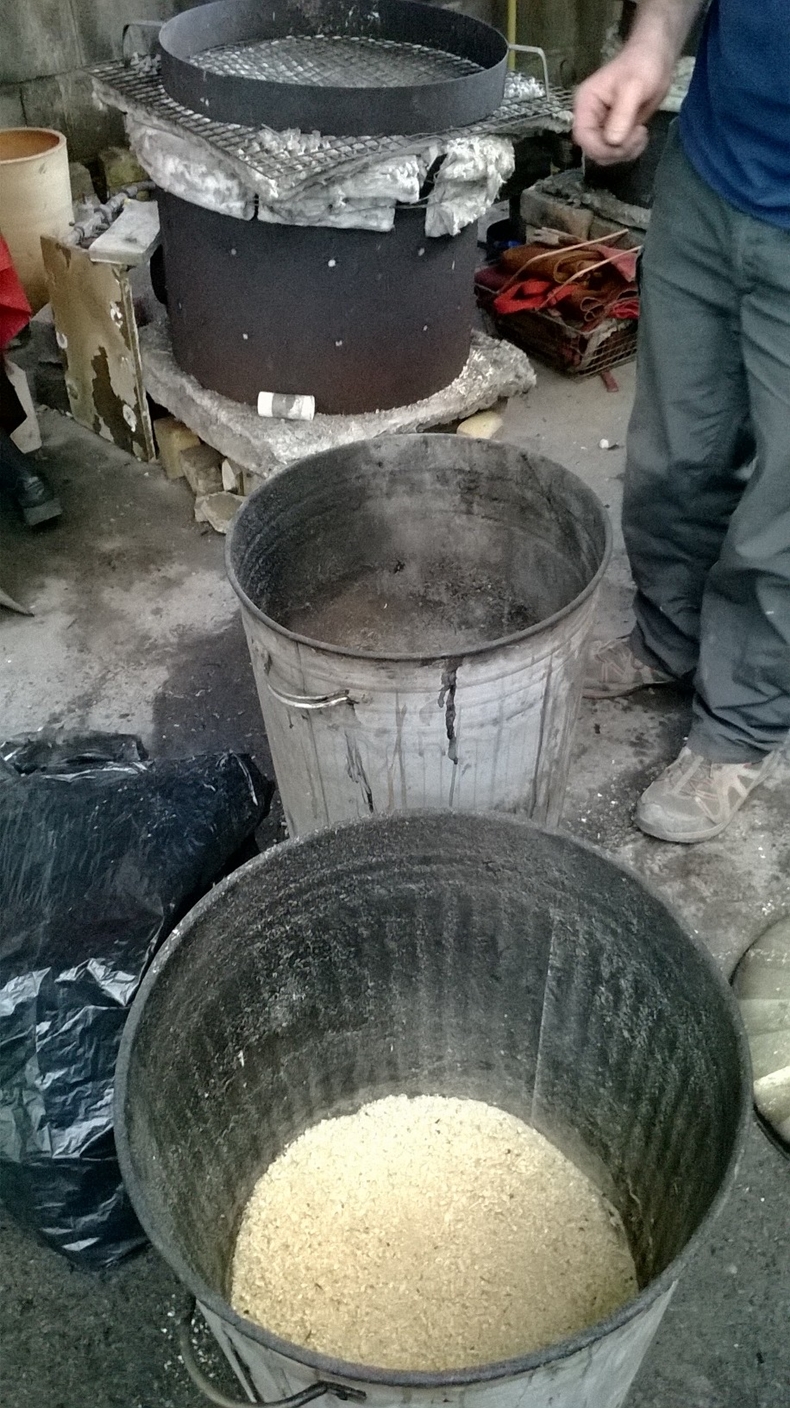
The bins full of sawdust, ready to put the work into to create the reduction atmosphere necessary to bring out the colour in the glazes
It’s hot work, putting the pieces into the sawdust ignites it, creating a whoosh of flame and smoke, which only increases and intensifies as you heap newspaper and more sawdust on top of the work. Once the bin is full, and almost too fiery to approach, the lid is slammed on, and the whole bin is put into the extraction cupboard, which draws away the smoke.
This is how my pots came out, I’m really really pleased with the results.

This is a pot glazed with a black copper matte glaze, gorgeous colour flashes within the copper

And the underside of the same pot

My favourite, the interior is the most gorgeous intense copper, with black and blue iridescent flashes around the rim

Gunmetal, blue and green flashes at the rim, copper interior, and a white crackle glaze on the exterior surface
Excellent result. For my next firing, I want to use glazes I have mixed up myself, and see if I can get them to exhibit the same strong copper flashing as I managed to get in the above pot.
Gathering Lichen Textures
Posted: March 22, 2014 Filed under: Field, Personal 2 CommentsThis is how I have been gathering Lichen textures in the city, for my clay tiles.
First, I go for a walk along a predetermined route, planned out according to routes I take to and from university. I select a “good” tree, such as this one:

A “good” tree, with lots of surface textures and lichens
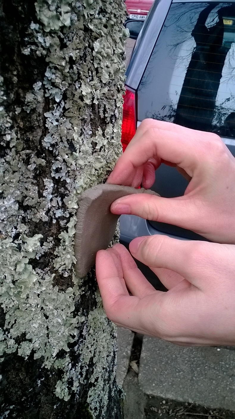
I carry the pre-cut clay tiles with me in a tupperware, sandwiched between layers of paper. I remove one, select a suitable area, and press the clay onto the tree surface, using my fingers and thumbs to squash the clay into the depressions in the bark and the lichen. I am using Raku clay for these ones.

Lichen with the clay tile pressed onto it
I then wait a few minutes for the clay to dry a little, before carefully peeling it away from the trunk.
Peeling off the clay tile

Almost fully removed, the texture of the lichen clearly marked upon the surface of the tile
My tiles have all been bisque fired now, I just need to mix up glazes and fire them. This is what my desk currently looks like, full of tiles and other bisque fired work! Now just to glaze and fire them all.

My cluttered space, full of bisque fired clay, and some glazed (but unfired) bits
Textures Within the City
Posted: March 10, 2014 Filed under: Field, Personal Leave a commentToday I went out for a walk with a handful of pre-cut clay tiles, to press onto interesting textures as I came upon them. I focused mainly on natural textures, such as lichens and tree bark, but I did take a few of stone surfaces and tarmac. The natural surfaces made far more complex and interesting imprints than the man-made surfaces. Linking back to my research into happiness within the urban environment, I think the visual appeal of the naturalistic tile impressions is down to an inherent human preference for the “grown” texture/surface over the “made” texture/surface. When people are asked in public surveys about their reasons for liking where they live, often they say that the green spaces in their location make them happier. I think that the modern age approach to building (sleek steel, glass and smooth facades) is markedly devoid of naturalistic texture or colour, and this contributes to the general unhappiness expressed by city dwellers. I am wondering whether this can be remedied or alleviated in some way by creating textural interiors, in mood-enhancing colours, and so I am exploring colour/texture in these tiles. I will look at glazing some of them in natural colours (lichen greys and yellows, bark browns and mossy greens), and some of them in the colours that are said to make you feel most positive (blues), and see how the colour of the glaze affects the impact of the tile.

Tree bark photographed on my walk, beautiful mossy greens!

Knobbly, rough and lumpy bark on the same tree

Yellow and grey lichens on a tree, the colours and the textures are both visually engaging

Excellent textural contrasts between the lichens and the cut twigs on the trunk of this tree
I then pressed the tiles onto tree trunks over lichens and varying bark textures. I used raku clay, as well as sanded buff. The sanded buff picked up clearer details, but I prefer the look and the feel of the raku clay for this exercise, so I think I will continue with the raku clay.

Raku clay tiles with bark and lichen textures

Sanded buff tiles with bark and lichen textures

Raku clay bark texture

Sanded buff clay with strong lichen imprint
Gathering Clouds
Posted: March 5, 2014 Filed under: Field, Personal Leave a commentI have been taking some photos of the sky whilst out wandering around Cardiff, looking into the same sources of inspiration behind the work of Toni Grote and Georgie Vinsun. Looking at these photos, I want to isolate colour palettes, then explore how I can recreate them using glazes on my cup-buttons and tiles.

Penarth: Greys, pinks, oranges and yellows

Cathays: Blues, Greys, Vanilla

Cathays: Slate blues and milky silvers

Parkway Station, Bristol: Lilac, Mauve, Peach and Orange
I want to see if I can express these sky colours using raku glazes, so need to find recipes for the various tones, and then experiment with them on test tiles, once I’ve got a reliable working pallette, I can begin glazing the cup-buttons and final tiles.
